RESULT
40% increase in feature adoption.
5% increase in good chats.
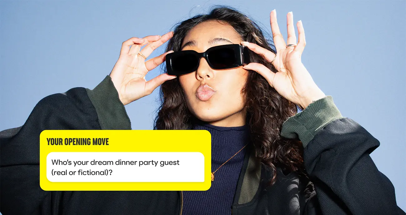
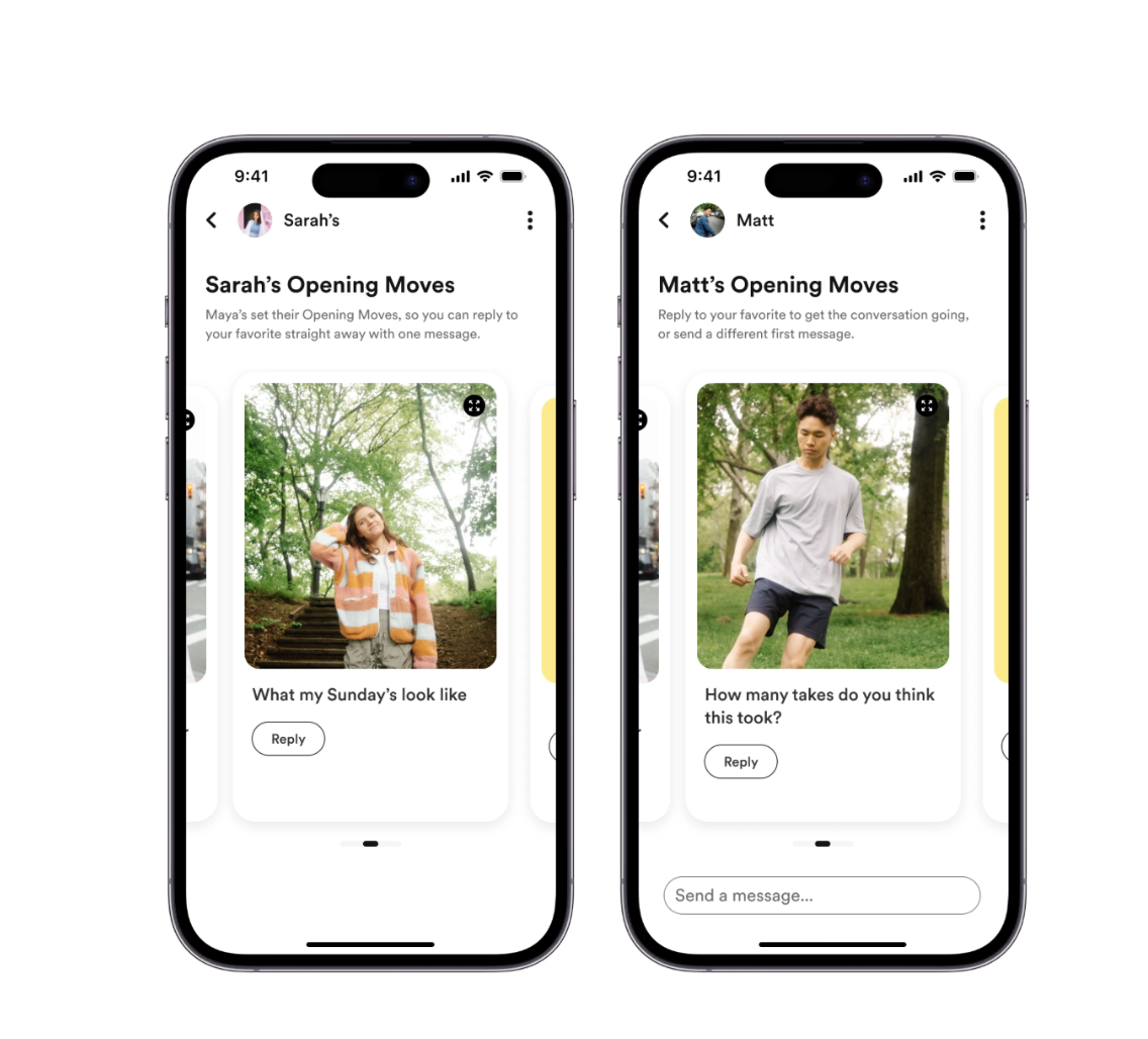
Bumble very publicly announced a rebrand and a new feature, Opening Moves where men could respond to a women's Opening Move prompt. However, the new feature wasn't meeting users' expectations, and usage rapidly declined.
At the start of 2024 Bumble released Opening Moves. The feature was designed to alleviate the pressure on women to always have to make the first move after matching, whilst still maintaining their control. This was a huge move for Bumble, away from "Women make the first move" to "Make the next move." However, the mechanics of the feature and how it was messaged were confusing to users.
At the same time, Bumble made 40% of its tech force redundant. As the new Connect team who, bar 2 engineers, had never worked on chat before, we needed to get up to speed quickly and deliver.
*Most Bumble users identify as straight, which influenced the design primarily for heterosexual relationships. However, in California, where it was previously illegal to create a binary design for men and women and non heterosexual relationships the feature accommodates both parties equally.
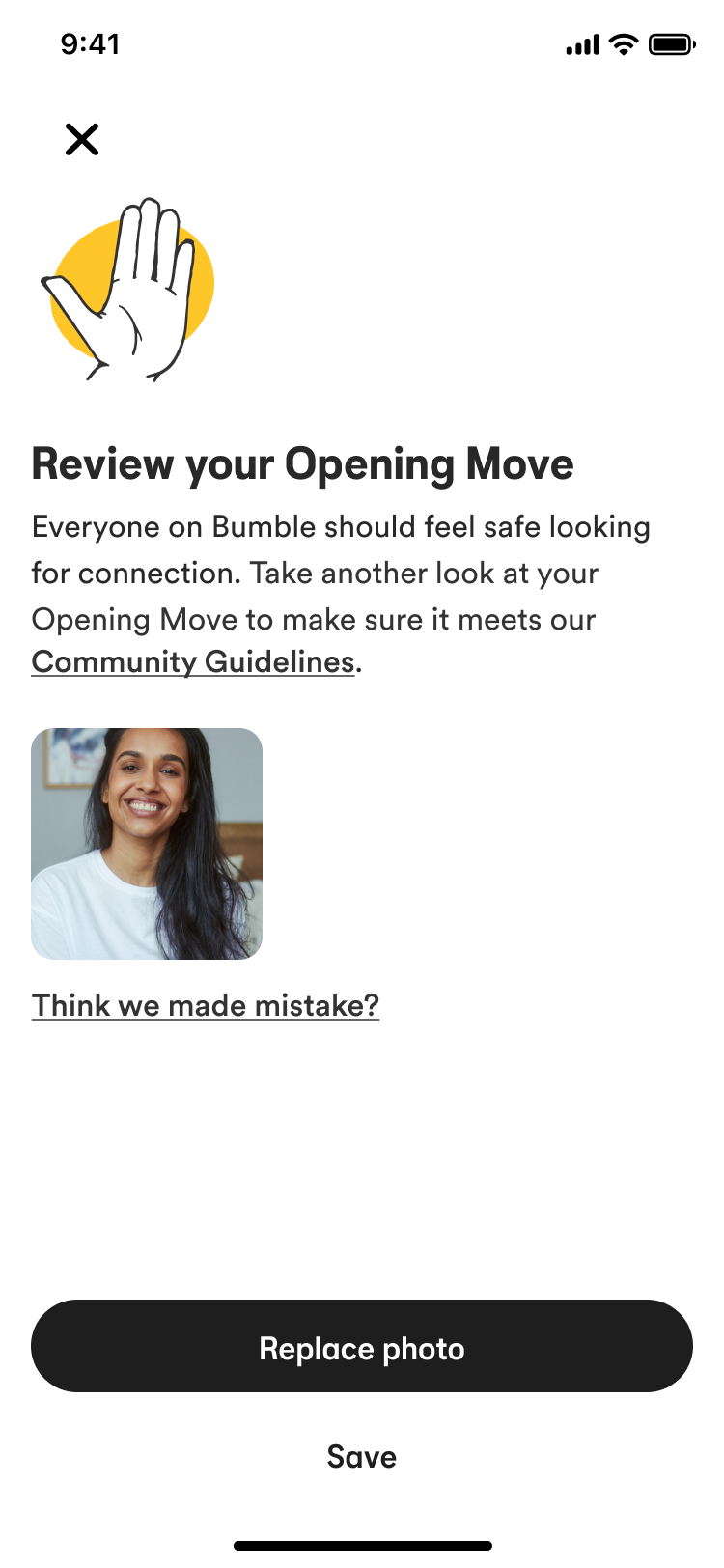
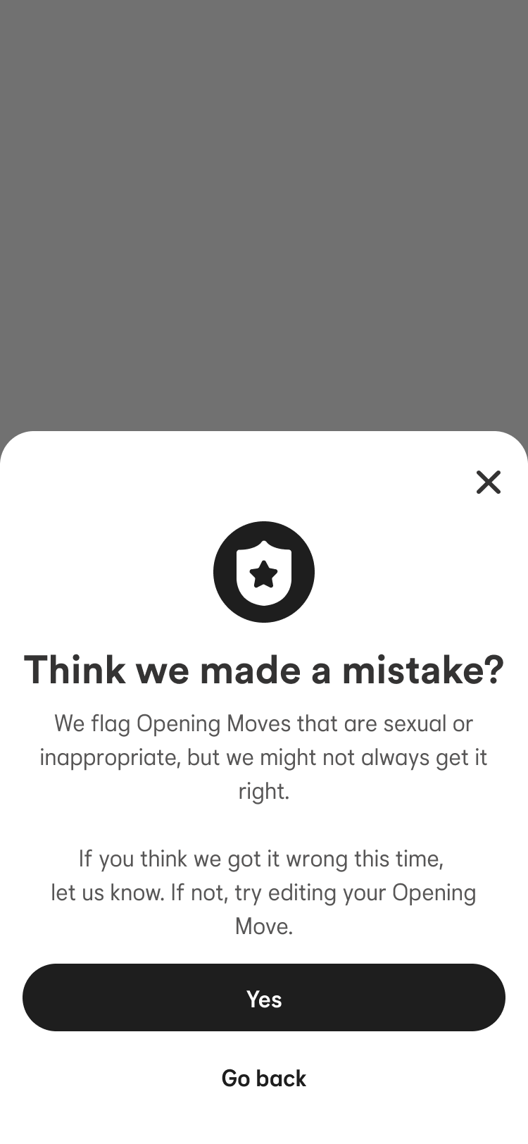
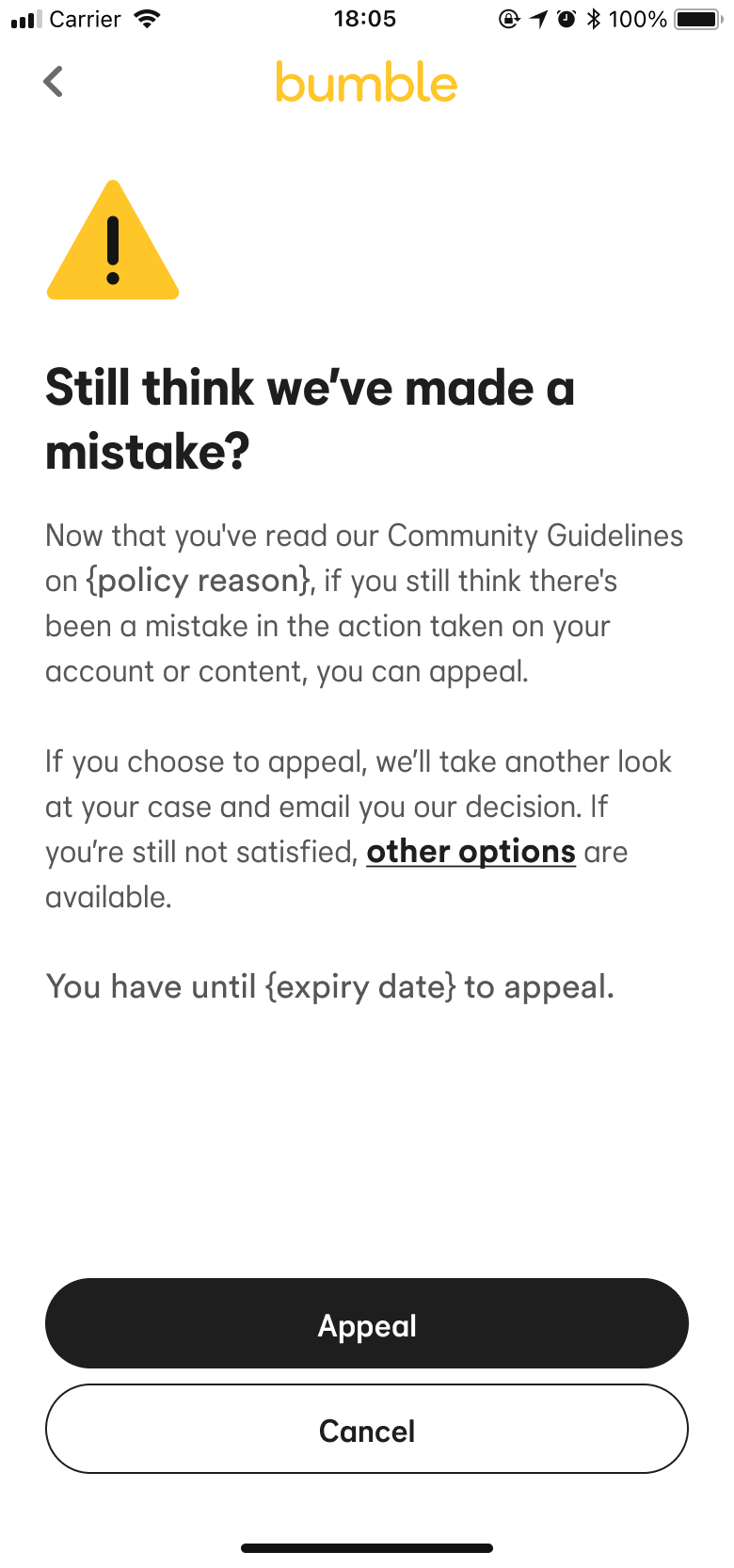
Risk minimised greatly by adding a review flow
Adoption, understanding and good chats all increased.

Women's feedback
"I'm still starting 98% of the conversations. It's frustrating because when I have an opening move I actually want it to be answered but it's completely forgotten"
"Having fake conversation starters only makes the situation worse."
Men's feedback
"I set an opening move and none of my matches acknowledge it... Most people don't respond to them. They just start the conversation with 'hi' and completely ignores my opening move."
30% of non adopters didn't use the feature because they didn't understand it.
Building clarity from the start
We kicked off the design process with a workshop to gather ideas from the entire team, as I believe great ideas can come from anyone, not just product. The workshop also established clear design principles to help us prioritise what we work on.
Principle 1
Clarity

Principle 2
Flexibility
Principle 3
Safety first
Building education touchpoints
The first job the content designer and I worked on was doing an audit of all the education pieces around Opening Moves. This way she was able to tackle each piece and give a clear narrative, this saw a 5% increase in feature usage.
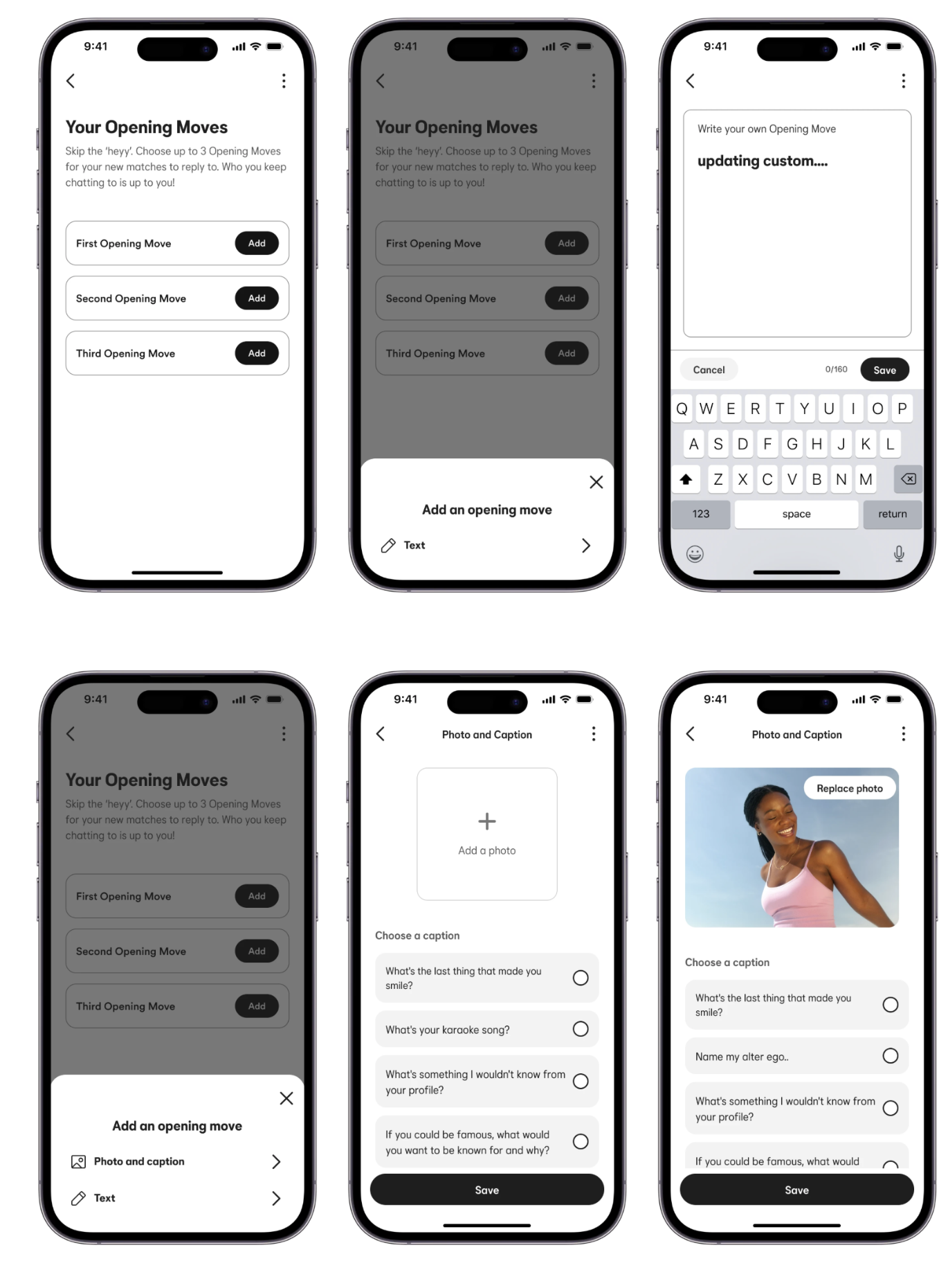
Allowing freedom to show personality
Our large scale survey results showed that the fixed nature of the options for opening moves made users feel "fake" and disingenuous, we wanted to allow custom opening moves through image and text.
Safety
The ideas we wanted to give this feature centred around individuality, allowing users to show more of their personality and themselves. But that meant people writing their own Opening Moves, adding their own images, and we wanted to do this in a safe way. So we partnered with the safety team and worked on ways we can use AI to gather sentiment of messages and flag inappropriate images. These required their own flows and working with the customer service team.
Ease confusion
One of the features that added to the confusion was that men could write an opening move but women would not be able to write directly back to the opening move, so a message appeared without context if they did respond, but most likely women gave up. We designed the feature so the functionality worked equally for men and women.
Patience
When working on this project, it was easy to spot changes that needed to be made. However, as a new team, devs needed time to work out the tech space. I created a design backlog in Figma which meant, working with the devs, we were able to efficiently scope each project and then prioritise with our PM.
Build trust
With our success for Opening Moves my Content designer and I were able to ask to lead the team in a 2 week sprint to gather feature ideas and concepts. The result was a series of low and high effort ideas that we were able to act upon.
Always happy to have a chat or a coffee, whether it's a big product challenge or just a conversation, feel free to reach out.